
Headless Commerce
Meet your shoppers and buyers anywhere with our trusted headless commerce solution. Use headless APIs and connected customer data.
Meet your shoppers and buyers anywhere with our trusted headless commerce solution. Use headless APIs and connected customer data.


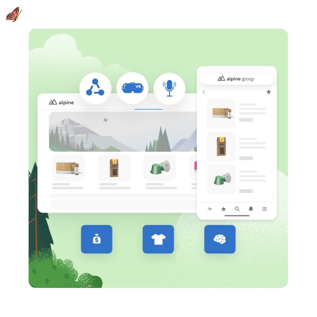
With Commerce Cloud’s trusted headless commerce platform, B2C and B2B businesses can meet customers anywhere. Headless APIs can weave commerce into any touchpoint, from social media to in-store kiosks to B2B buyer portals, and give you the power to take full control over the front-end.
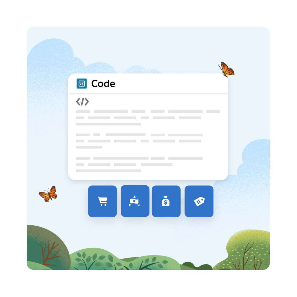
Build with the front-end framework of your choice on top of our headless APIs. Whether you’ve already invested in a decoupled front-end, or your developer team has a specific front-end technology of choice, you have the freedom to build or bring your own storefront.
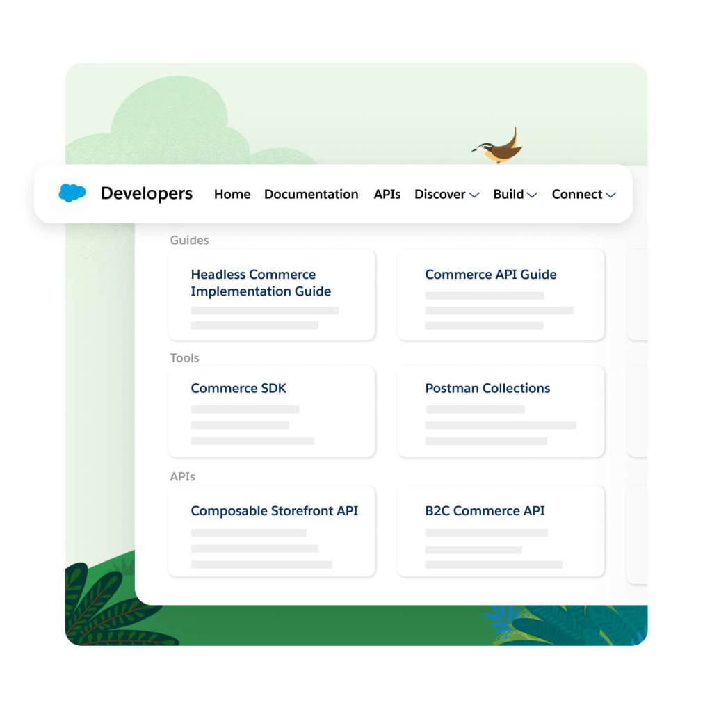
Discover, share, and build custom apps quickly in the Salesforce Developer Center with tools, learning resources, and a community of experts. This one-stop-shop includes everything your developers will need to build and maintain a headless commerce architecture with Commerce Cloud.
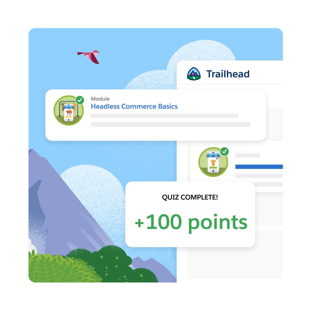
Keep learning, innovate fast, and speed up time to market with best practices for building headless experiences. Developers can elevate their skills and learn at their own pace with our self-guided Trailheads for headless commerce.
Unlock new revenue channels everywhere, from social media to marketplaces to buyer portals. Leverage our complete set of shopping and data APIs to connect all touchpoints and back-office sources, turning any channel into a buying channel.

Enhance your shopper or buyer experience by adding custom functionality with API extensions. Need an API that returns your specific data, with custom objects, formatted for your use case? No problem, developers have the flexibility to create custom API endpoints for specific use cases.
Provide fast API responses across all channels with reliable, scalable APIs. API response caching helps reduce the data size and response times for common APIs by avoiding a trip back to the database.
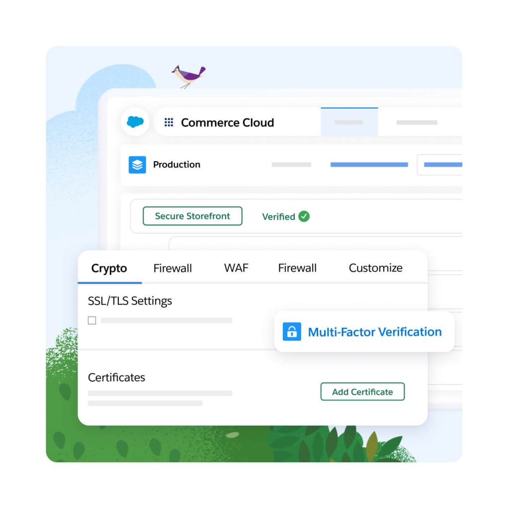
Rely on the #1 trusted commerce platform for global enterprise scale with 99.99% historical uptime and over 10 billion API calls handled over Cyber Week. Get full visibility when you subscribe to notifications for planned and executed maintenance of the API services.

Never worry about your site going down thanks to trusted security tools, technology, and resources built in. Everything from advanced threat protection to 24/7 monitoring is included — that means no unplanned downtime costs.
Accelerate success with confidence thanks to implementation services from trusted Salesforce advisors. Enjoy services like targeted guidance and best practices via expert coaching sessions, 24/7 year-round phone support and developer support, so there's always hands on-deck to analyze and troubleshoot custom code.

Accelerate ROI with a fast and flexible storefront for headless commerce.
Unify your customer data and take action on insights with AI and automation in real time.
Cut costs and drive efficient growth with the customer-first order management system.
Get more conversions with less work using embedded AI.
Meet shoppers and buyers anywhere with headless commerce for B2B and B2C.
Create AI-powered experiences with templates, composable storefronts, headless APIs, or all three.
Sell online with multiple storefronts for businesses and consumers.
This edition requires an annual contract. This page is provided for information purposes only and subject to change. Contact a sales representative for detailed pricing information.


Sign up for our monthly commerce newsletter to get the latest research, industry insights, and product news delivered straight to your inbox.
A headless commerce platform provides commerce services and APIs that can integrate into a decoupled digital storefront.
A headless commerce solution lets you make changes to the storefront without having to touch the backend. This means smaller and faster deployments, which enables more frequent changes and updates that lead to a better experience and higher conversions.
Headless commerce platforms provide commerce services that power the digital storefront using APIs.
Headless commerce is right for businesses looking to unlock agility and flexibility. It's usually the best fit for organizations with large, digitally mature development teams.


